
Visual hierarchy involves organising graphical elements based on their perceived importance.
This technique guides user attention, allows for quick comprehension, and creates a clear navigational flow.
Here’s a breakdown of six key tips to keep in mind that can enhance a designs impact and elevate the user experience.
Reading patterns
People naturally skim read – scanning titles, picking out keywords in descriptions, and even relying on images for context. Your eyes do this instinctively, often without you even realising it.
Confirmation bias refers to people’s tendency to seek out and recall information that confirms their pre-existing beliefs. Designs should capitalise on this by strategically positioning key elements where viewers eyes are drawn to first, meaning that the viewer feels listened to.
Through recognising this subconscious cognitive effort, we can develop layouts that effectively enhance user engagement.
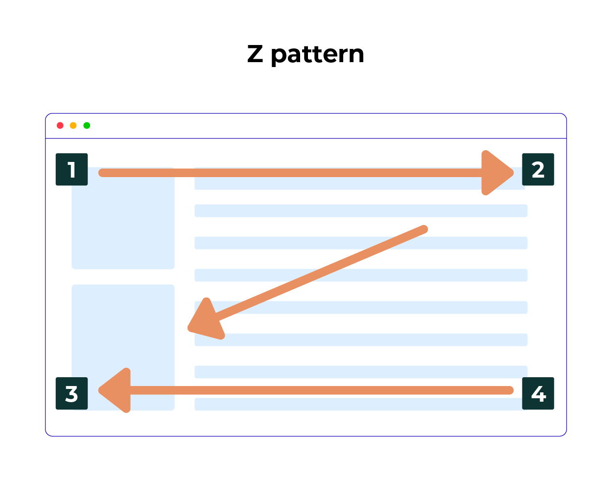
Z Pattern
The Z-pattern is often observed in Western web design, where users scan horizontally across the top, diagonally down, and horizontally across the bottom.
Placing key elements, such as headlines, visuals, and call-to-action buttons along this path, designers can create a more intuitive and engaging user experience. This pattern emphasises the strategic use of visuals to naturally guide the eye and emphasise important information.
You would typically see the Z-pattern on pages which have less text or content, such as landing pages and home pages.
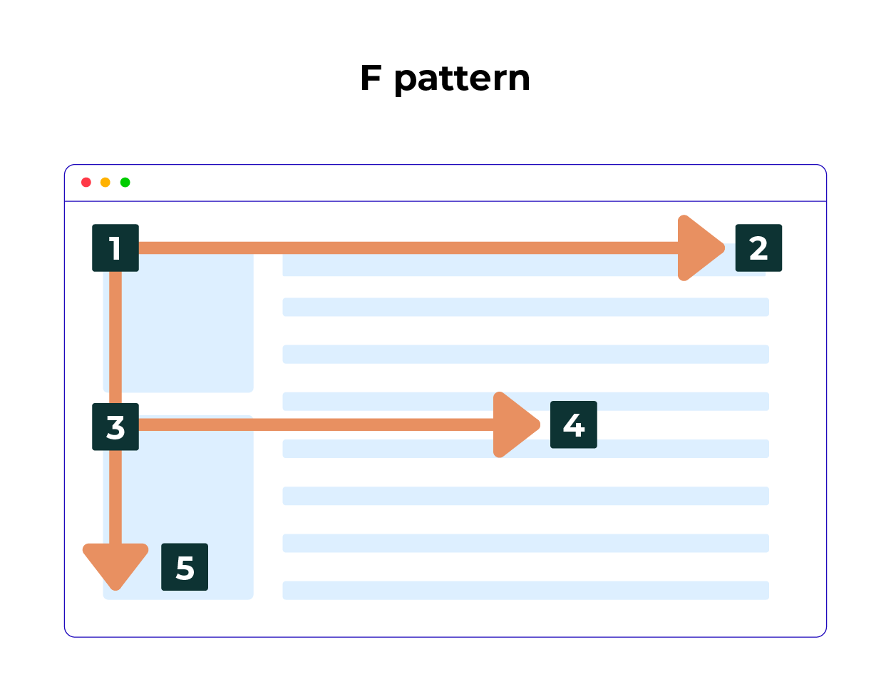
F Pattern
The F-pattern reflects how users typically scan text. Users read horizontally from the top, then vertically down the left, followed by shorter horizontal scans.
Understanding this pattern helps designers place the most important information, like headlines, key points, and calls-to-actions along these focal areas to maximise visibility and engagement.
You would typically see this pattern on more text heavy pages. Including blog posts, news articles or even search result pages. These types of pages are more likely to include visual cues or videos to break up the page.
Alignment
Alignment is the arrangement of elements on a page including the text, images and buttons.
It’s a fundamental design principle that helps create a visually appealing and organised layout, by providing balance and guiding the viewers eye.
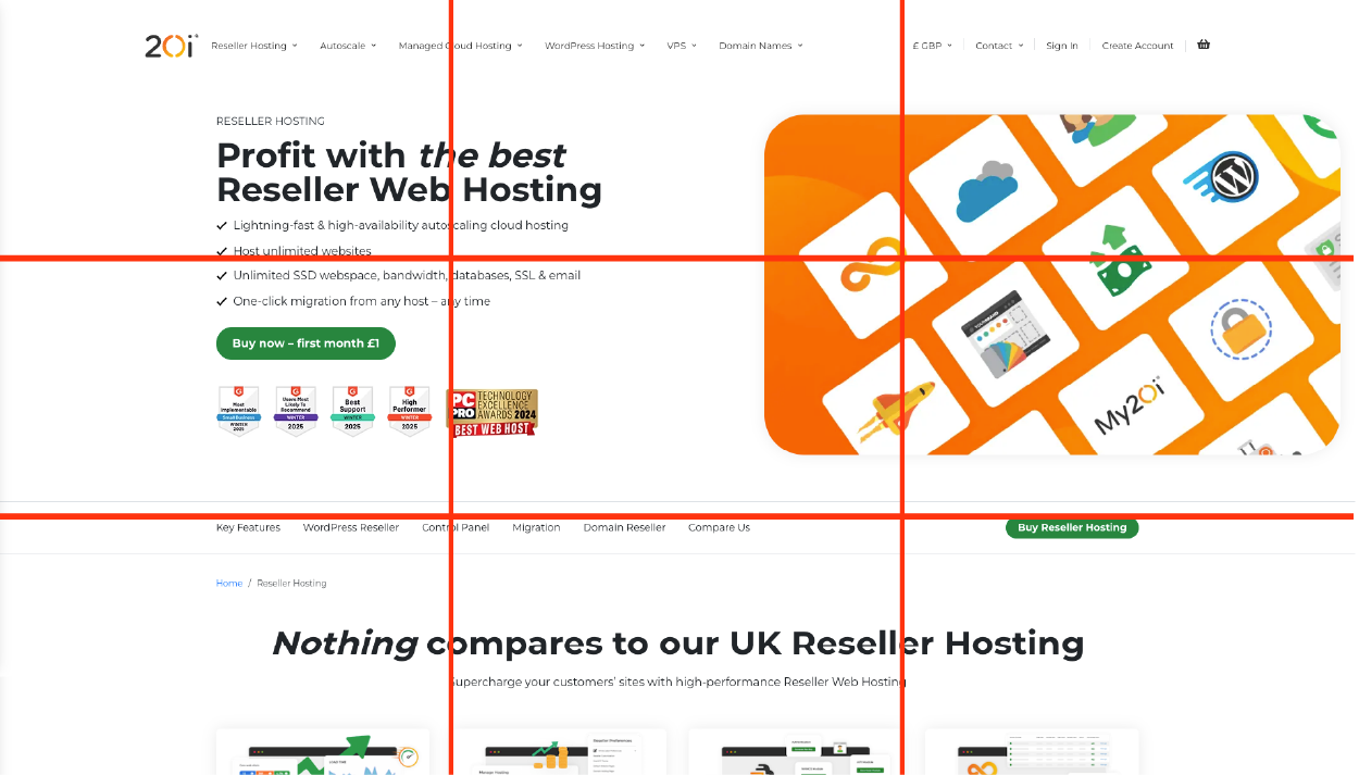
Rule of Thirds
This is based on a grid pattern and suggests dividing an image into nine equal parts. This improves visual balance and interaction in a layout. Important elements are placed along these lines or at their intersections.
Our Reseller page effectively demonstrates strategic content placement, ensuring users immediately grasp the key selling points.
Through thoughtfully arranging elements, we guide the viewers focus to the most critical information, enhancing clarity and engagement.
Rule of Odds
Compositions with an odd number of elements are often considered more visually appealing.
It creates a sense of balance while avoiding a static or an overly symmetrical appearance. The use of an odd number naturally draws the eye, establishing a focal point and a smooth visual flow.

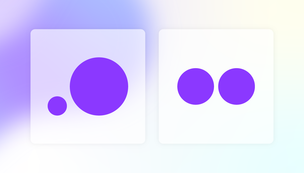
Size and Scale
Size is the physical dimensions of an object, and the scale is the relative size of different objects or elements in relation to one another.
Larger elements are often perceived as more important. Larger text as a heading, for example, immediately gives you a signal of its prominence.
Even though both images below use circles, the left image feels more dynamic due to the variation in size and scale. This subtle use of scale makes the design more visually engaging, often without the user consciously realising why.
Through utilising these tools, designers can ensure the most important elements of design stand out, and that the viewers eye is guided through the content in a logical, and engaging way. This is also relevant with typography and colour.
Colour and Contrast
Colour attracts attention and signals importance. Brighter or more saturated colours often draw the eye to key elements.
Contrast on the other hand, refers to the difference between light and dark, influencing readability and visual hierarchy. It involves variations in luminance, hue and saturation to distinguish text from background elements effectively.
Hues refer to the specific colour itself, saturation indicates the intensity or vividness of that colour, and lightness describes the amount of lightness or darkness in the colour.
Fun facts:
💡 It’s not the actual colour that creates hierarchy, it’s the contrast in saturation between the elements and where it appears.
💡 Studies show that the brain processes contrasting elements faster, which makes them appear more important to the viewer.
💡Visual hierarchy leverages principles of the Gestalt theory. This theory suggests that humans naturally seek out order, structure and patterns for us to better understand and navigate interfaces, especially when elements are arranged with intention.
Our website provides a great example of how colour and contrast can be effectively used to draw attention to key sections and guide the users focus. The contrast between the green and the white below automatically makes the green section stand out without changing sizing.
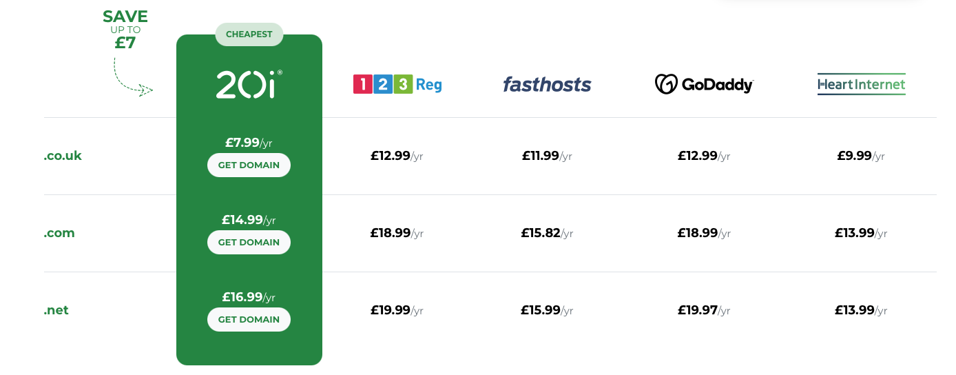
Here’s an exercise. Looking at the image below, where are your eyes drawn to first?

Hopefully you read ‘Unlimited Reseller Hosting’ and if you did, great!
Through using colour, we’ve guided you, the viewer, to what we want you to read first.
White Space
White space is space that is intentionally left empty.
It’s important to allow space around design components, as it provides breathing room for important elements, drawing attention to and highlighting them. This includes padding between elements or margins around the edge of the page.
It’s important to note that although it’s called ‘white space’ this doesn’t mean the space has to be white, it can also be referred to as ‘blank space’.
Leaving white space allows the user to focus on key areas of the content, improves the visual clarity, and allows for the design to be more aesthetic.
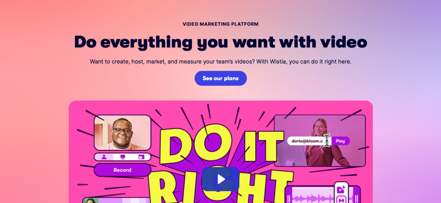
Below, can you work out which website utilises white space the best?
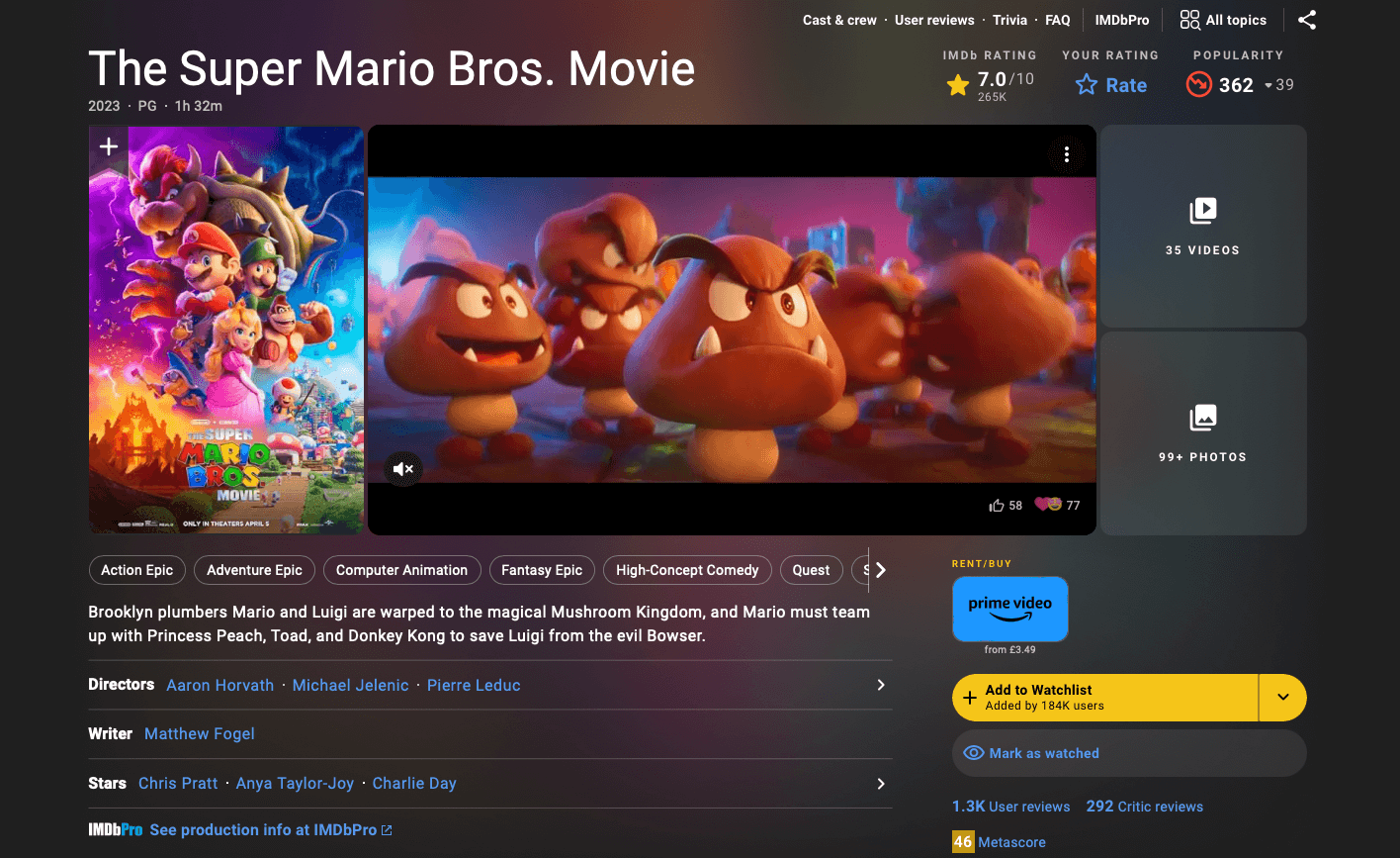
IMDb doesn’t use white space sparingly.
The page contains a lot of information, which makes it feel cramped and difficult to follow.
If they aimed to incorporate more white space, they could consider breaking up sections further to give the landing page more breathing room.
Wistia, on the other hand, has utilised white space to present their information clearly and create clear focal points.
Summary
The principles of visual hierarchy are guidelines to follow and make sure that your designs are looking clean, organised and structured.
Following these principles creates a smoother user experience and gives you, the designer, the ability to guide the viewers journey in the direction you intend.
