
 Michael Butler
You’ve meticulously planned out a web page, carefully structured key information, positioned CTAs for maximum impact, and ensured brand consistency throughout.
The design is ready to go.
Then comes the dreaded request: “just add another paragraph there”, “fill up that space” or “can we make that logo bigger?”.
They’re said with good intentions, but does adding more content really add value?
In this blog post we’ll look at the power of using whitespace to control user experience and influence the overall perception of a brand.
Passive vs Active: Knowing the Difference
Not all whitespace is made equally. There’s a big difference between space that just happens to exist, and space that’s been deliberately created to support the design.
Passive whitespace occurs naturally as elements are positioned within a layout, it isn’t necessarily bad, but left unchecked can lead to visual inconsistencies.
Active whitespace on the other hand, is used deliberately to enhance readability and establish hierarchy. It’s not just what’s left over, it’s a core part of the layout.
Whitespace also behaves differently depending on the device. On smaller devices where screen real estate becomes limited, spacing becomes even more critical.
Making sure you’re allowing enough breathing room between interactive elements isn’t an aesthetic choice, it’s essential for usability.
What feels clean on desktop can quickly become cramped or chaotic on a smaller screen without carefully managed spacing.
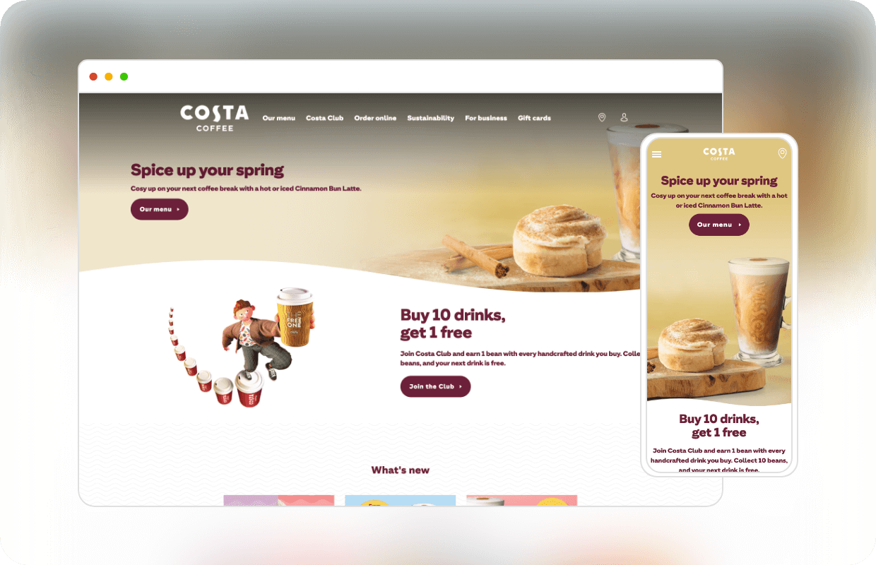
Take Costa’s homepage as an example. On desktop, the wave-shaped divider adds passive whitespace that unintentionally disrupts balance, creating more space above the image on the left and less above the text on the right. The effect is amplified by a large visual gap and a small section title below.
On mobile, the issue shifts. The image-heavy hero forces a tall header, pushing key content further down the screen, potentially decreasing user engagement.

Subtle tweaks such as tightening margins and decreasing spacing makes the layout feel more deliberate. The ‘What’s new’ section is also moved into the fold, likely to increase scroll depth.
In comparison, Starbucks effectively uses containers and ample spacing to find a balance making for a clean, approachable experience.
Content is framed within generous page margins, the spacing between sections is consistent, and information feels easy to scan.

Whitespace in Practice
Hick’s Law tells us that more choices lead to slower decisions. But that’s only part of the story. As Nielsen Norman Group explains:
“Displaying a high number of options makes the screen appear more crowded and the menus more complex. As a result, it’s harder to notice and attend to the option of interest…”
Whitespace plays a key role in solving this problem. It breaks dense content into manageable steps and helps users focus on what matters.
On mobile, this becomes even more important. With limited space and a vertical scroll bias, spacing becomes the tool that separates content into scannable sections and keeps the layout feeling stable.
In more complex interfaces that include elements like filters or dropdown menus, intentional spacing helps users track changes without losing context. Every margin and divider is a chance to reduce friction and support confident decisions.
The Premium Approach
Apple’s homepage works because of what it doesn’t show. It’s super-clean, minimal and spacious. It oozes that upmarket, luxury feel, but we’ll get onto that in a bit
Worth a watch is this tongue-in-cheek video of Microsoft ‘redesigning’ the iPod packaging. It perfectly highlights the contrast in design philosophies between the two companies:
Now, humour me. Imagine you’re the sole designer at Apple HQ, working on the homepage. You notice movement out of the corner of your eye.
Tim Cook himself is walking over, hands poised for screen-smudging, finger extended in judgment. You show him your latest design:

He squints at the screen. “Look at all that unused space… can we just add some more products in?” You smile to hide the pain and honour the request.

“Perfect! Don’t you think that’s much better?”
Obviously, that’s not how things work at Apple. But the joke lands because we’ve all been there.
Apple’s homepage works precisely because it doesn’t try to show everything at once. The space isn’t wasted; it’s backed by psychological principles that shape user perception.
The Halo Effect
When users encounter a clean, polished design, they often project those qualities onto the brand and products.
This is known as the halo effect: a cognitive bias where positive impressions in one area have influence in others.
In Apple’s case, the refined layout suggests that the products themselves are equally refined, before a user even sees one.
“The halo effect allows us to make snap judgments… we only have to consider one aspect of a person or design in order to ‘know’ about all other aspects.” — Nielsen Norman Group
The Aesthetic-Usability Effect
Apple also benefits from the aesthetic-usability effect, where users perceive visually attractive designs as more usable, even if they aren’t. A clean interface with generous whitespace feels easier to interact with, even if the underlying mechanics are no different from a less-spaced layout.
“People tend to believe that things that look better will work better—even if they aren’t actually more effective or efficient.” – Nielsen Norman Group
Together, these biases influence how users feel before they even interact with the product, building trust and desire through design alone.
Of course, Apple’s design style isn’t universal. Many factors influence design choices, and a minimal, full-width aesthetic won’t work for everyone.
For high-end brands, whitespace becomes part of the value proposition. It signals quality and exclusivity, mirroring the in-store experience.
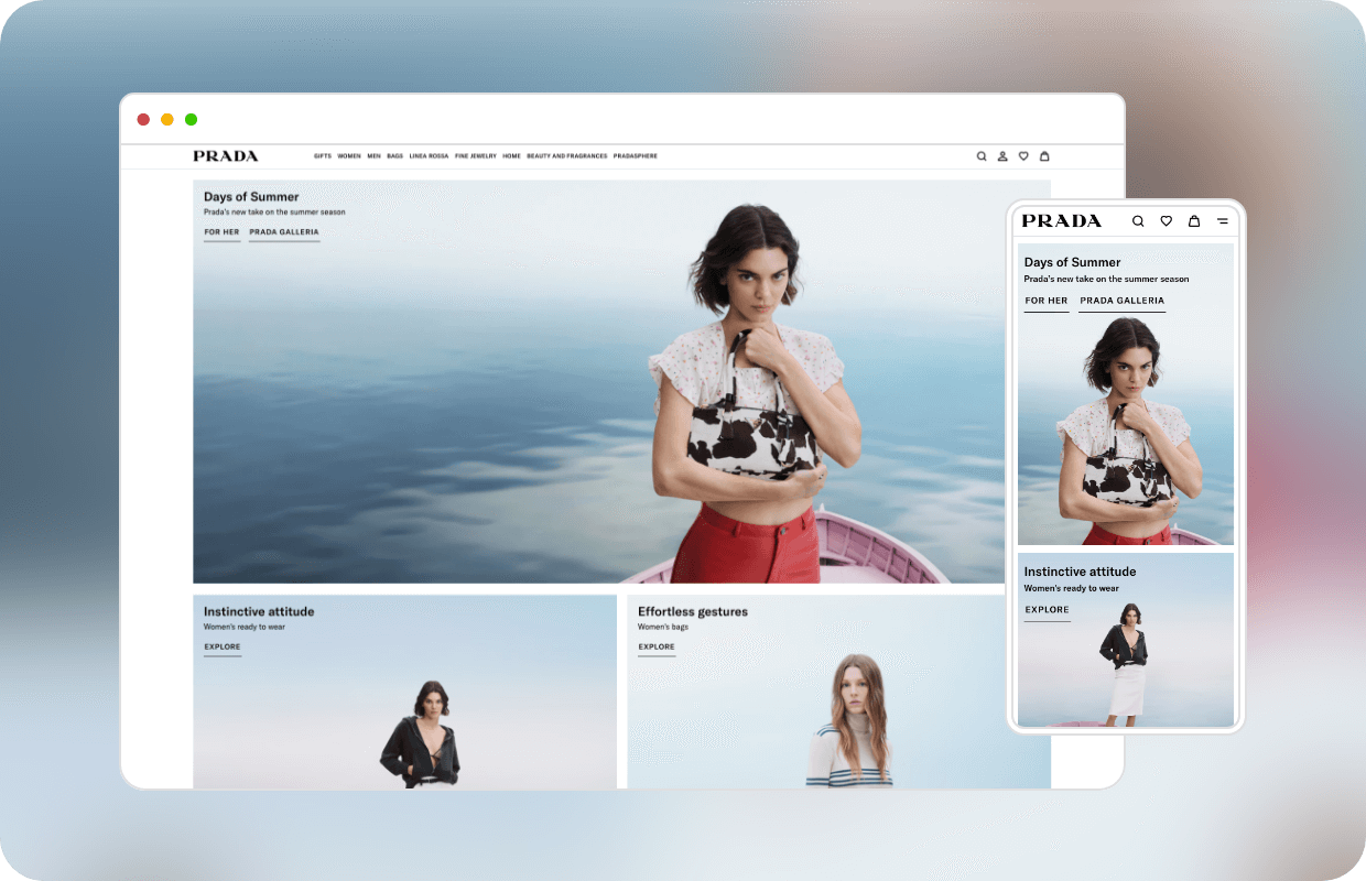
In entirely different sectors, luxury brands like Prada apply the same principle: fewer products for a clearly defined audience, and layouts that strip away distractions to let the products speak for themselves.
The Mass-Market Approach: Busy By Design
Mass-market brands take the opposite approach.
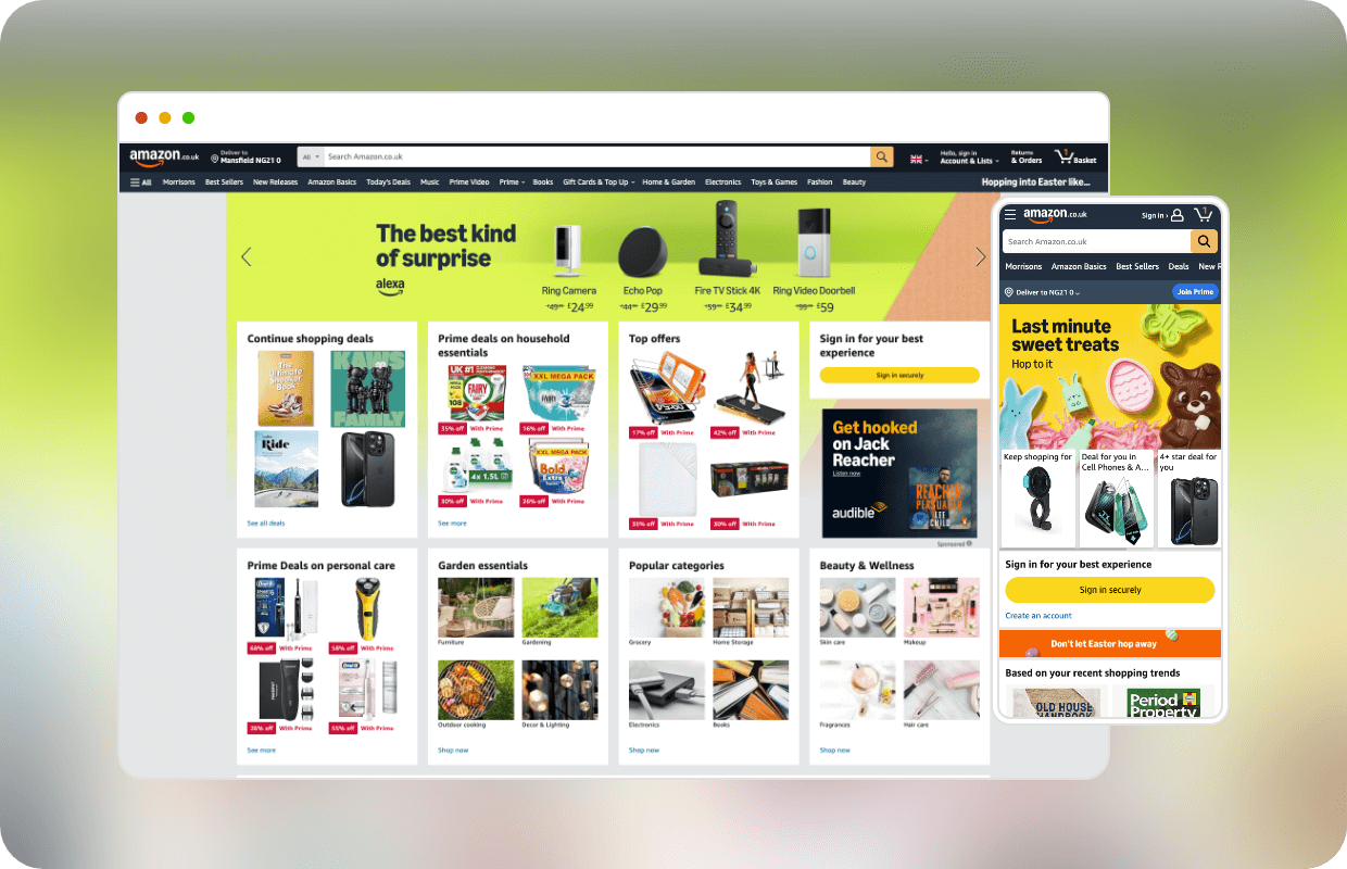
Ecommerce giants like Amazon and fast-fashion retailers favour busier layouts packed with options and urgency-driven elements to maximise conversions and usability.
While whitespace in luxury design creates a sense of exclusivity, mass-market brands rely on visual density to encourage immediate action.
It’s important to note that neither is right or wrong. For mass-market companies, the layout is needed to do more, because it has to.
Whitespace still plays a role, but it’s less about tone and more about function.
Although it remains one of the most successful websites in the world, Amazon’s homepage is a prime example. With so many competing elements it’s often unclear where to start.
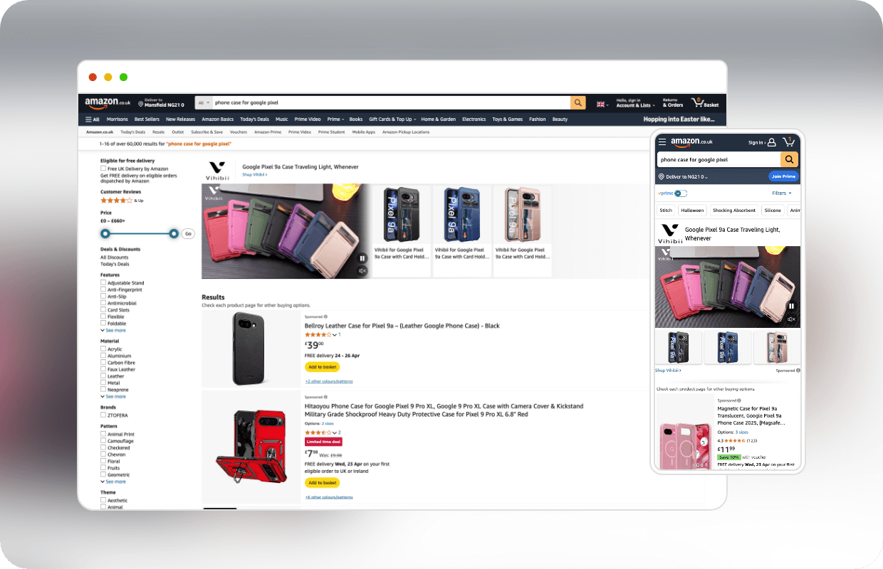
That said, the homepage isn’t necessarily where the journey begins. In most cases, users arrive from a search like “phone case for Google Pixel” and land directly on a more focused results page, where whitespace is used more to support scanning and comparison.
It’s All About Balance (And Grids)
Although a powerful tool when used correctly, whitespace can also be the downfall of a design.
There’s a balance between using padding and spacing to add clarity and going so far that the layout starts to feel unstructured or incomplete.
Minimalism isn’t about removing information; it’s about removing what’s unnecessary. Strip too much away and you lose flow and usability.
This usually happens when designers ignore grid systems (and let’s be honest, there’s no excuse). Grids are what make freedom legible. Consistent spacing and alignment provide the rhythm that makes whitespace feel intentional rather than accidental.
The Need For Speed Whitespace
When working with clients or stakeholders, convincing non-designers to leave whitespace unfilled can be challenging, especially when the instinct is to cram in more content.
In the event of being asked to ‘just add more’, the best approach is to show rather than tell. Wireframes and prototypes help visualise how whitespace improves readability and focus, while data provides context.

A/B testing spacing variations can reveal how users respond to different layouts. Do they scroll deeper? Convert faster? Using this data to fine-tune the experience shifts the conversation from opinion to outcome.
When you present a design with supporting evidence, whitespace stops looking like a gap and starts being seen as a tool. It becomes part of the performance argument, not just the visual one.
As designers, it’s on us to push back when more isn’t better. So next time you’re asked to fill the gaps, pause, look at the data, and ask: how much space does this design actually need?
To Conclude
Whitespace isn’t about leaving space blank; it’s about making space work smarter.
Whether you’re crafting a premium brand experience or optimising for a busy e-commerce flow, whitespace shapes how users feel, think, and act.
Of all the tools in a designer’s arsenal, whitespace is one of the most powerful. Not because it draws attention, but because it decides where attention goes.
So, the next time someone asks you to fill a gap or squeeze more in, remember: if everything shouts, nothing’s heard. That’s the power of whitespace.


 Ben Perry
 Izzy Hackney
 Richard Chambers


Add comment