Creating the best portfolio has become an arms race in the creative space. How do you build something exciting without turning the user experience into a chore?
Here are 8 portfolio websites which manage to balance joy with flawless usability. Prepare to be inspired!
Dave Holloway
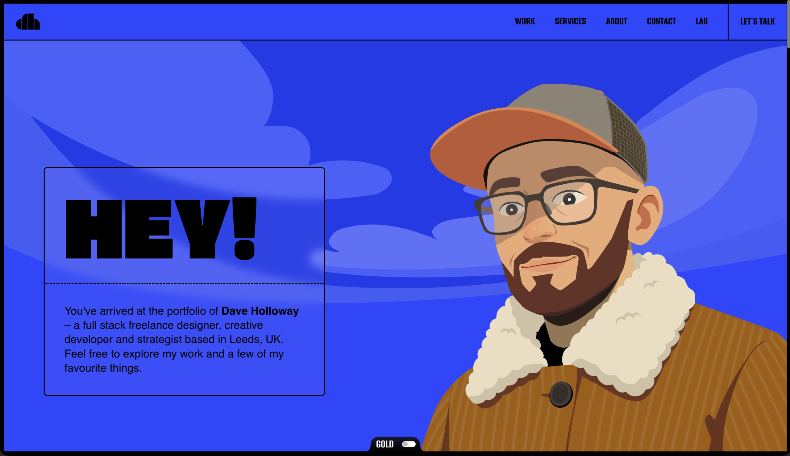
Dave’s website is a masterclass in showing personality. From the moment the page loads, you’re greeted with a charming character that tracks your cursor, instantly drawing you into his world.
As you scroll, you’ll discover a drag-to-navigate service menu and even a mini game hidden partway through.
It’s clever, entertaining and proves you don’t have to sacrifice traditional navigation to show off your human side.
⚡️The vibe – playful, personality-driven and interactive
Marimba Designs
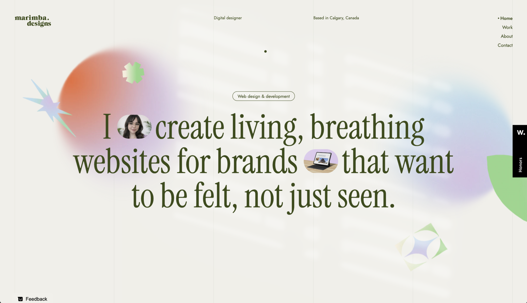
If you’re looking for an aesthetic portfolio, then look no further! Marimba’s website is a digital therapy getaway from aggressive dark modes with neon text to calming pastel tones and elegantly picked typography.
The site effortlessly guides you through her creative process. Keep an eye out for the subtle light-leak effect that reveals itself as you scroll to the footer.
It’s not just a showcase of design; this site helps evoke a feeling of calm 🧘🏻♀️
🌻The vibe – soul-soothing, pastel dreamscape
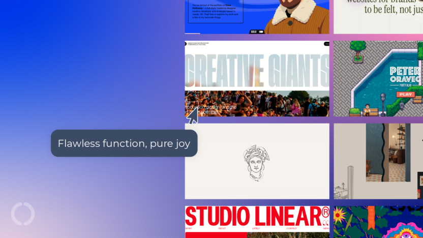
Creative Giants
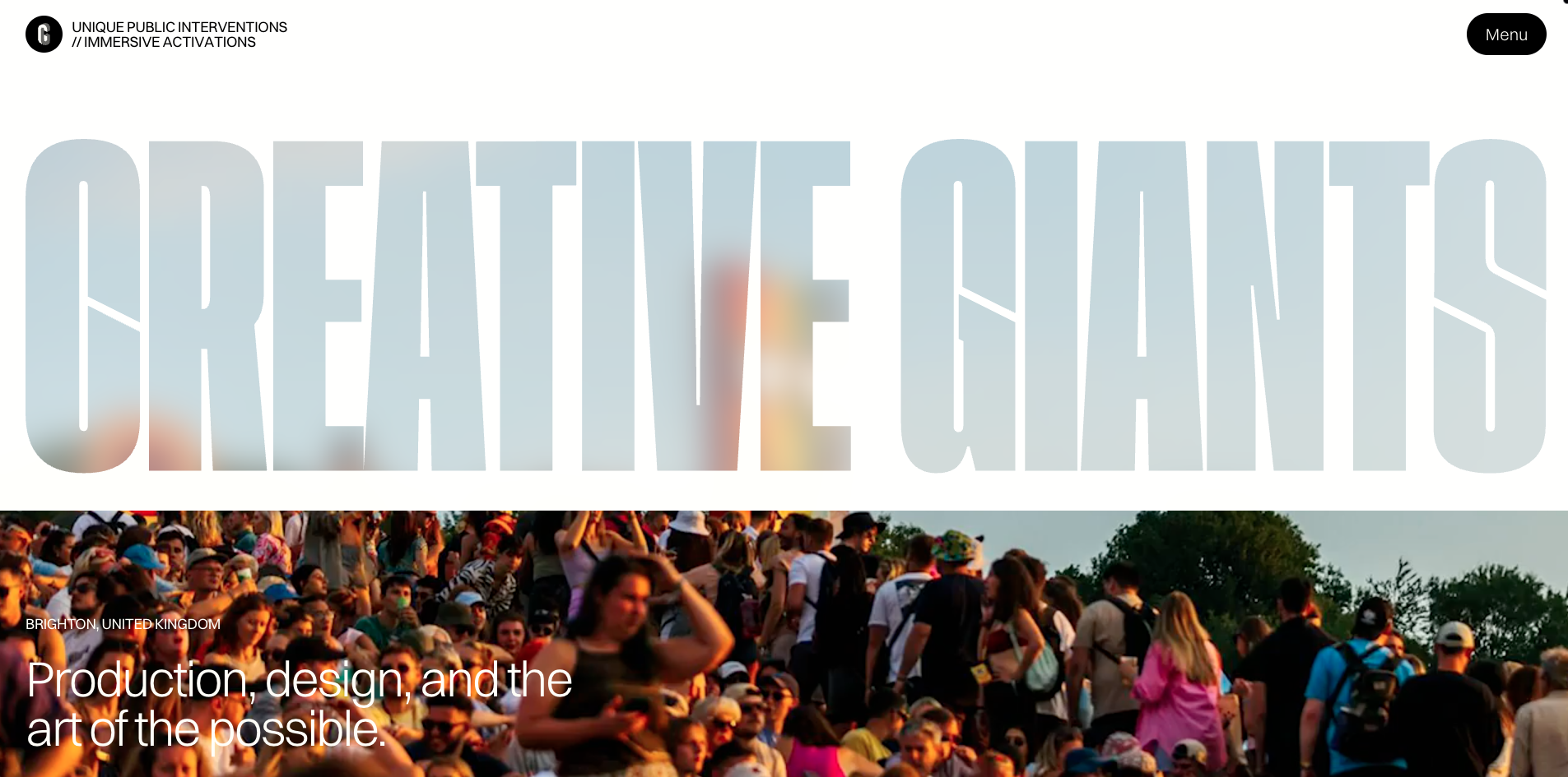
They say don’t judge a book by its cover, but you can absolutely judge this agency by their name. Creative Giants deliver a maximalist masterclass with bold colour pallets, vibrant background videos and MASSIVE typography.
What makes it work is how dynamic it feels. Text overlays shift nicely over multimedia elements as you move by, with a slick parallax scroll helping to keep you anchored so you don’t get lost in the noise.
It’s high-energy web design done right.
Peter Oravec
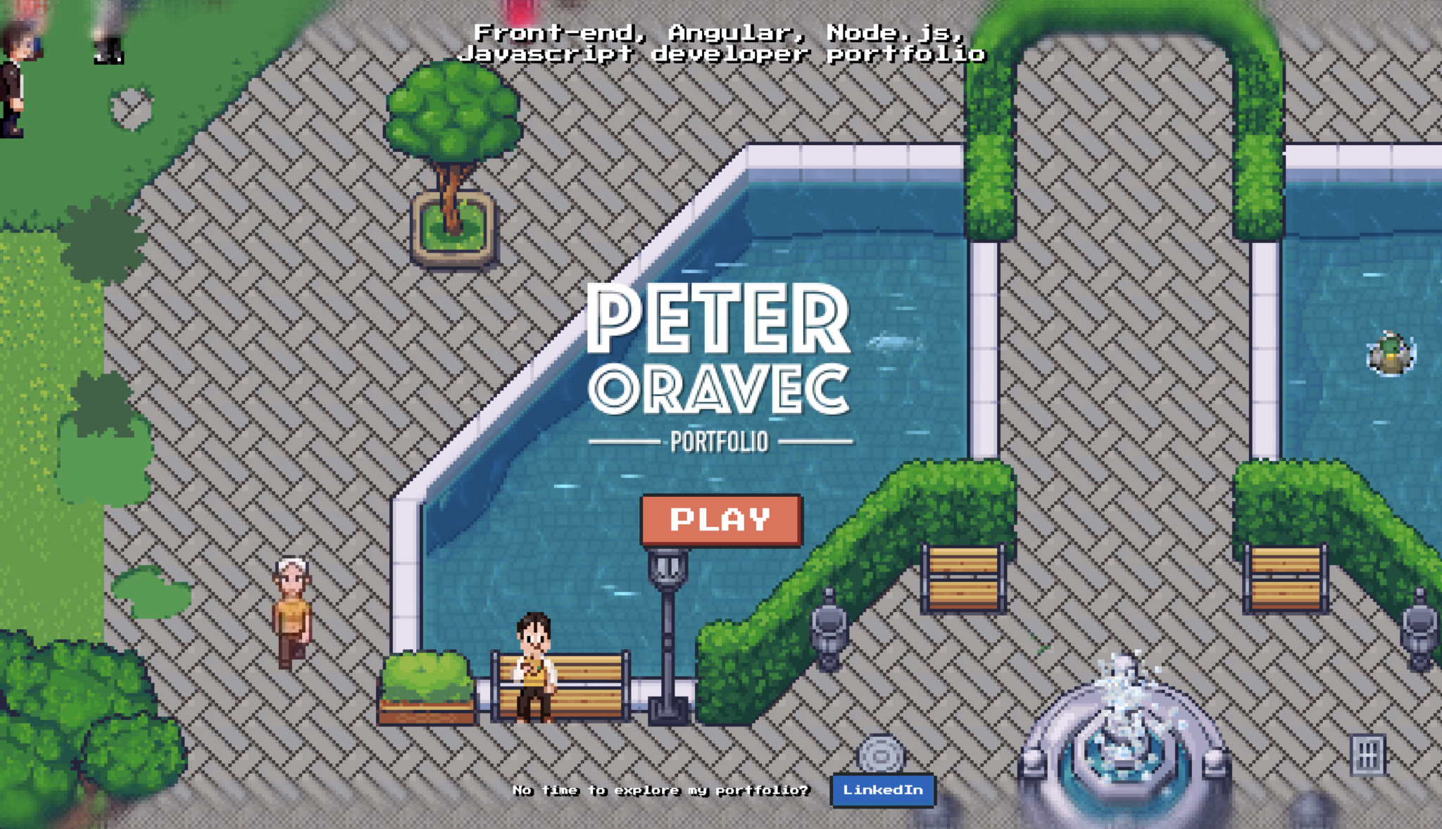
Modestly describing himself as ‘just a front-end developer’, Peter has built an interactive playground that will instantly take you back to the early-2000s school computer game nostalgia.
Instead of a simple vertical scroll, users use their keyboard arrows to move a character around through a retro game landscape, uncovering his CV and project history.
It’s imaginative, incredibly fun and a brilliant testament to what front-end code can do when you let creativity take the wheel.
🎮The vibe – pure Miniclip nostalgia
Adovasio

Landing on this portfolio doesn’t feel like your usual opening of a website. It feels like a cinematic experience.
Specialising in wedding photography, Adovasio uses lovely animations to set a premium, yet emotional, tone.
The layout lets the stunning images do the heavy lifting, maintaining a clean, sophisticated editorial flow whilst ensuring the contact information is only a click away.
✨The vibe – cinematic, elegant and romantic
IDST
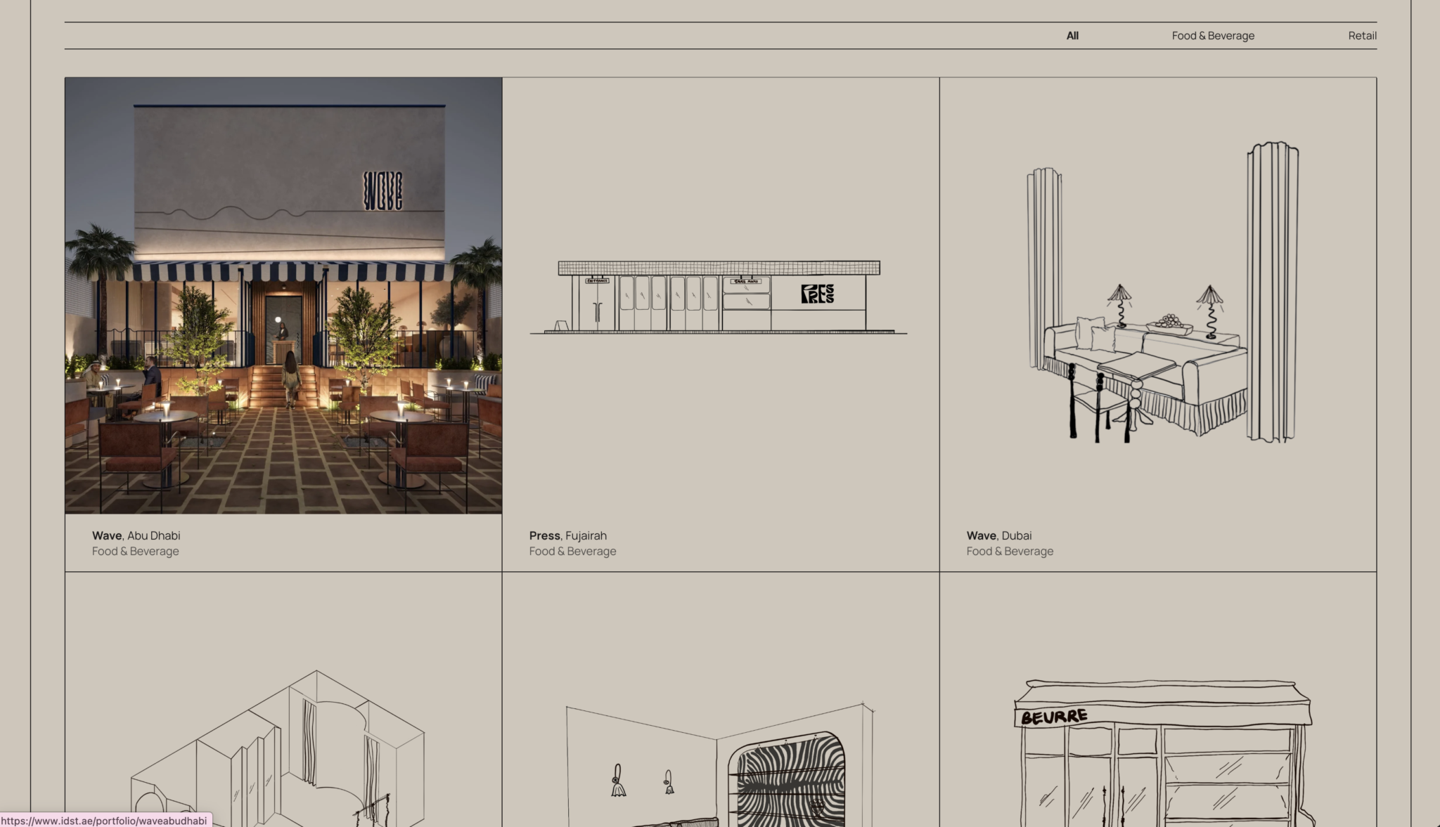
How do you make a furniture and architectural portfolio stand out in a sea of identical 3D renders? IDST have smashed this by leaning into the human touch.
The studio overlays hand-sketched drawings onto their spatial designs, creating an unusual and fun-to-look-at aesthetic.
This, combined with the colour palette of calming browns, greys and deep oranges, elevates the architecture into a living, breathing piece of art.
📐The vibe – editorial, tactile and hand made
Studio Linear
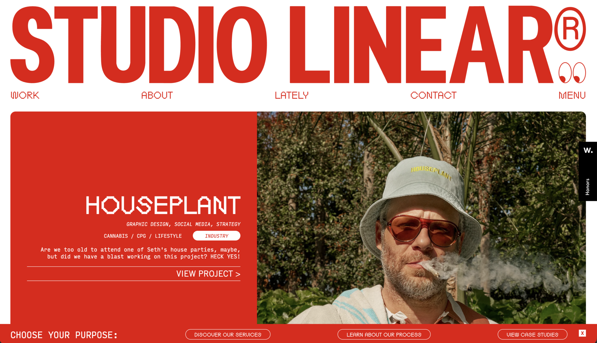
Studio Linear bursts with vibrant, retro energy that feels like a high-end digital scrapbook.
The page flow is organic and packed with details like animated eyes that follow your cursor across the separate projects.
It’s inquisitive and unconventional with features including a game tucked away in the footer. You won’t get bored exploring this!
🍟The vibe – American diner meets digital scrapbook
YES NOW
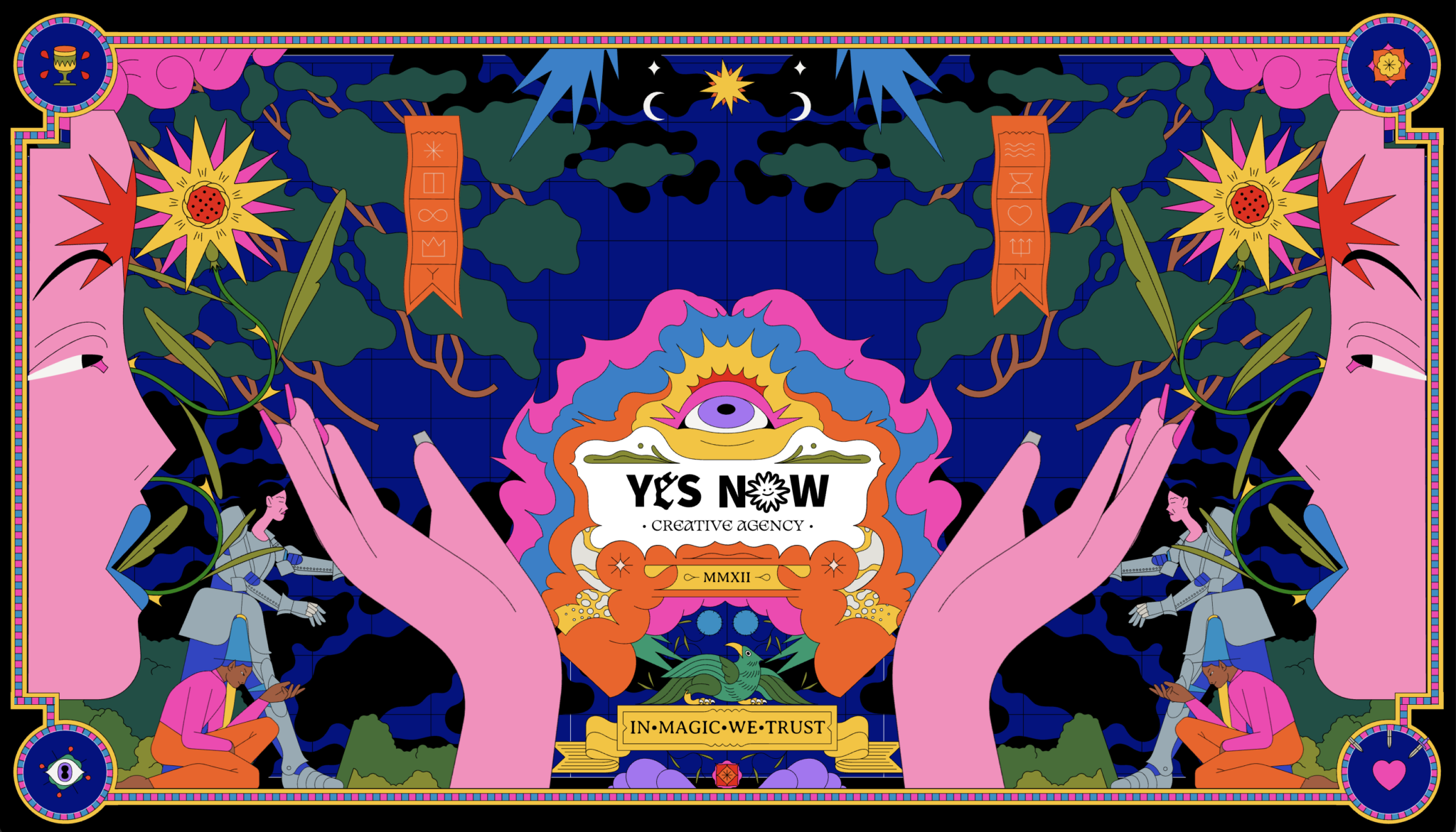
This portfolio is a wonderful acid trip of artwork and animation.
Embracing a fun whimsical ‘witchy-vibe’, the site utilises tarot cards and festival-poster style layouts that are miles away from the standard corporate agency.
With clever parallax scrolling guiding you through the magic, it it captures the unpredictable storytelling of interactive web experiences. In magic we trust, indeed.
🪬The vibe – psychedelic, mystical and wonderfully weird
Final thoughts
I If these portfolios prove anything, it’s that the internet doesn’t have to be a sea of identical, sterilised corporate templates. Whilst standard frameworks have made the web more accessible and functional, lose the sense of experimentation and personality that makes the internet great.
Building a portfolio is a balancing act. You don’t need to turn your home page into a fully-fledged 3D video game if it doesn’t fit your brand, but adding subtle interactive nods, clever animations or unique visuals can turn a mundane scroll into a truly fantastic interactive experience.
The tools available for modern web developers and designers are more powerful than ever, so let’s use them to keep the internet weird, creative and fun!
Which of these portfolios inspired you the most? Let us know in the comments! 👇