
Most websites are built based on what the client wants. But the truth is that what the client wants isn’t always going to be what converts.
This is where conversion rate optimisation (CRO) comes into play.
It’s a useful skill for any web developer or designer to have in their toolbox.
Not only do you make yourself more valuable to the client, but you can also offer conversion rate optimisation as an extra service. This can be as a one-off service, and/or an ongoing service where you run split tests to further improve conversions.
There’s a lot to learn about CRO, but there are several basic principles that you need to know.
In this post, I’ll share a bunch of these CRO principles and how you can use them to grow your revenue faster.
Let’s get started:
1. Put customers at the heart of every website build
A website is only as good as the results it delivers for a client.
And delivering results requires that you understand everything about the people the website will serve.
This means you’ll need to request buyer personas from your client, or ask your client some pointed questions so you can develop one for the website build.
So, what is a buyer persona exactly? A buyer persona is simply a profile of your ideal customer. It should factor in demographics such as age, gender, education, etc.
It will also include goals, challenges, values, possible objections to your client’s service/product, etc. Along with their online activities such as how often they use the internet, what social networks they prefer, what forums/communities they frequent, etc.
WiredImpact.com has a good article that explains the types of questions to be asking your client.
What’s next? You’ll need to consider this information in the build process.
For example, if your client has a target audience that consists of the over 65, you may need to reconsider elements such as font size, or elements they may be unfamiliar with such as the hamburger menu.
And if your client’s audience is more active on Pinterest, you’ll want to display Pinterest share buttons on blog posts, and possibly on media elements to encourage social sharing.
2. Go beyond UX basics and consider website flow
Improving user experience is all about removing friction and possible conversion roadblocks across the entire site.
And most importantly, balancing business goals with the expectations of the user.
It helps to visualise a website in terms of a sales funnel. Here’s a great visual from TD Insights that illustrates which types of content best serve the different stages of the funnel:
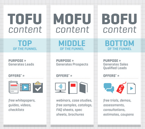
On a typical website, the job of each page will be to direct the visitor to the next stage in the funnel.
Again, a big part of this comes back to the use of buyer personas. With that information, you can make every page address their concerns, objections, and needs.
3. Fewer choices will lead to quicker decisions
Have you ever sat down in a restaurant and opened a menu only to struggle to decide what to order?
This is because of a concept known as Hick’s Law. In a nutshell, this means that the time it takes for a person to make a simple decision increases logarithmically with the number of choices they are given.
To improve conversion rates, Hick’s Law is something we need to consider. Ultimately, this means simply giving people fewer options and removing possible distractions.
When dealing with calls to action (CTAs) that are a simple button, this is easier to do.
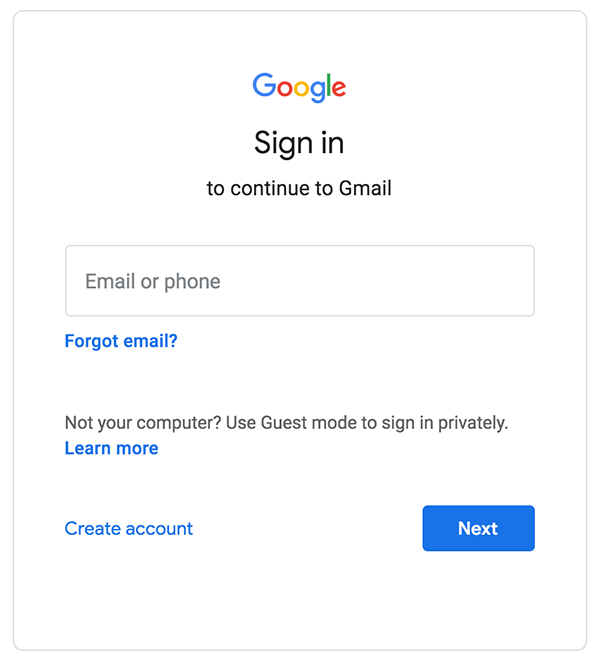
But what about something more complicated like a form that requires many fields?
In this case, you can simply break the form down over multiple pages. We can see this type of thinking in action all over the web. One example is Google’s sign in page:
4. Don’t reinvent the wheel – use proven page layouts
When building a website, it’s completely understandable to want to create something that’s unlike anything else out there.
The challenge with this approach is that consumers get used to certain types of pages looking & behaving in a certain way – people prefer websites that feel familiar (or what’s often referred to as websites with high prototypicality in the UX world).
When websites deviate from that norm, it can cause confusion. And as a result, conversions can decrease.
On the flip side, when you align page layouts, website structure & behaviour with consumer expectations, you’ll typically see an improvement in conversions.
5. Use genuine trust markers & social proof to improve conversion rates
In order to turn a regular website into a conversion-focused lead generation machine, you need to establish trust & build credibility.
This can be done with the use of genuine trust markers.
So, what are trust markers exactly? Here are some common types you’ll likely have seen before:
- Industry awards
- Testimonials
- Celebrity endorsements
- Reviews
- Accreditations
- # of customers
- “As seen on” logos
- Client logos
These are generally considered to be forms of social proof. In a nutshell, this concept means that people are influenced by the actions of others.
Exactly which trust markers you can use will depend on your client. It’s something to ask in an onboarding questionnaire before you start building the website.
And, as you’ll see in a moment, these trust markers can and should be used in combination with each other for maximum impact.
Now, let’s look at some specific examples.
On the 20i website, we make sure that our awards and recommendations are on clear show, so that visitors know that we provide a highly regarded service.
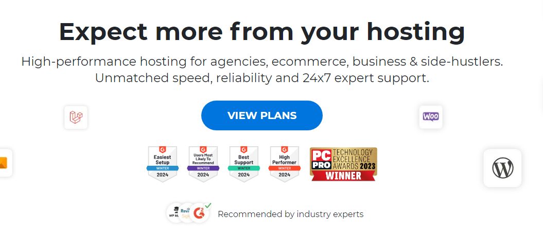
And we also have customer reviews from 3 different platforms on show, so you can see what real world users think of our service.

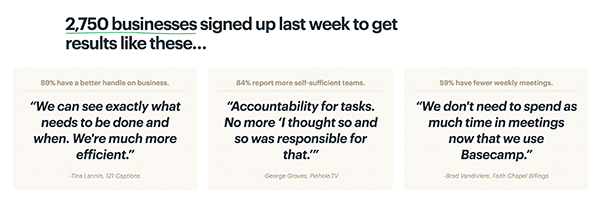
Basecamp’s customer numbers + testimonial combo
Basecamp is a popular project management tool. As such they can lean on some impressive forms of social proof. This includes a significant number of account sign ups, case study data, and testimonials.
While I’m not sure how well their homepage converts, I’d guess it does pretty well because in part because of this section:
Reverb’s social proof & scarcity
Now, let’s quickly look at an ecommerce example. And if you haven’t heard of Reverb, it’s pretty much the eBay of the musical instrument world.
In this example, Reverb are using social proof in a different way to what we’ve seen in previous examples.
They highlight when an item is in someone’s cart and could be sold soon. Along with displaying the number of people watching the item.

Since Reverb sell a lot of pre-owned musical gear, you only have one chance to get most items. FOMO is often abused as a marketing tactic, but in this example, it can be beneficial to the user. As an amateur guitar collector, I appreciate the value of this sort of feature because I’ve missed out on some significant guitars over the years.
The right way to use trust markers and social proof
While it may go without saying, it’s important that I clarify how these tactics should be used.
These sorts of tactics are abused frequently (particularly in certain verticals) and that’s what should be avoided at all costs. In the previous example, letting users know someone else has an item in their cart can benefit the user when there’s only one item available.
The key to using any form of scarcity or urgency is to use it only when it makes logical sense. If it were shoehorned into a website when it doesn’t make sense, then a positive improvement to UX becomes a form of deception (otherwise known as a “dark pattern” in the UX world).
The same goes for other trust markers – they should only be used in a genuine way, just like any other marketing tactic or strategy. To do anything different would cause significant damage to a brand that could have a lasting impact for years to come.
6. Use contrasting colours for your calls to action
One of the easiest conversion holes to fix in most websites is the button colour.
The problem is that most calls to action (CTAs) just blend into the rest of the design and become incredibly difficult to see.
When you use a contrasting colour for your CTAs, you’ll draw the attention of visitors to the CTA – which is exactly where that attention needs to be.
For every website build, I like to assign what I call an action colour. This action colour won’t be used in any other part of the design, and will contrast with other parts of the design.
Let’s look at the 20i Reseller Hosting page again as an example.

Here we have a page that uses white and orange as the core colours, but then the button to buy web hosting for £1 is in green, to help stand out from everything else within the page. To be clear, I’m not saying that any specific button colour will convert better than another, this is simply about making your CTAs stand out.
7. Create conversion-focused landing pages for PPC campaigns
In a technical sense, any page that someone “lands on” could be considered a landing page. But that’s not quite what I mean here.
A conversion-focused landing page is a page that has no header/navigation area and is created for a specific campaign. It’s typically isolated from the main website.
Here’s an example of a PPC landing page for an email marketing provider, SendGrid:
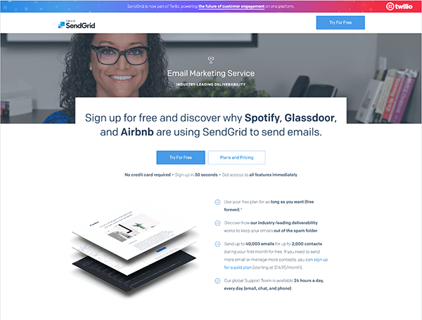
On this page, there are no navigational elements. It’s a single page with a single goal.
And even the footer area doesn’t have any navigational elements aside from links to legal pages:

So, why would your clients benefit from these types of landing pages?
The simple answer is that they convert far better than a regular web page.
Here are a few reasons why:
- Singular focus
- No distractions
- No other options (convert or leave)
- Can be targeted to specific buyer personas
For example, I threw together a quick landing page to build my email list for FunnelOverload.com. And without implementing any optimisation or A/B split testing – it’s converting at 30%.
Given the value these types of pages can offer, web designers can offer this as an additional service for new clients. You could also reach out to existing clients and offer it as a standalone service.
You could simply build branded landing page templates for your clients, or you could offer a service where you manage the process of running split tests to improve conversions. While many landing page builders include A/B split testing, this can be done for free with Google Optimize.
8. Keep core web vitals in mind
Putting it all together
Given their position as a search ranking factor, Googles core web vitals (CWV) are often looked at from an SEO perspective, however adhering to them is a very sensible conversion rate optimisation principle.
The core web vitals are all about the experience provided to the user when they load a page, and as such, will have a knock on effect on conversion rates too.
Many of the core web vitals such as LCP (largest contentful paint) and FID (first input delay) are related to page speed, which is proven to be a significant factor when it comes to conversion rates. A study from digital marketing agency Portent found that a website that loads in 1 second has a conversion rate 3x higher than a site that loads in 5 seconds.
Google have a case study showing the business impact of core web vitals, which includes mobile phone network Vodafone reducing their LCP loading time by 30%, and earning an 8% increase in sales following the change.
If you’d like to know more about the core web vitals, check out some of the posts that we’ve written about them:
- First Input Delay (FID – What It Is & How to Optimise It
- How to Reduce Largest Contentful Paint & Improve Website Performance
- How to Fix Cumulative Layout Shift (CLS)
9. Accessibility is ongoing
Web accessibility isn’t just about being compliant with regulations, it’s also about reaching a wider audience and potentially increasing conversions.
Most developers will be aware of surface level accessibility issues, but don’t often realise how deep they can go.
The Web Content Accessibility Guidelines highlight 4 key principles which should always be considered – known as POUR. These state that all content should be perceivable, operable, understandable, and robust. The Bureau of Internet Accessibility provides easy insight into what actions these principles can refer to.
It’s also vital to remember that accessibility is not a one-time fix. As websites develop, more features get added, and content gets changed, new issues may arise which could exclude a portion of your users
Regular testing and monitoring with various assistive technologies is crucial to ensure your website remains accessible as it evolves.
The business case for accessibility is clear too. A report from Forrester found that web accessibility and UX improvements return an average of $100 for every $1 spent. Another study by WebAIM found that websites with WCAG 2.0 AA conformance (a widely recognised accessibility standard) had a 28% lower bounce rate compared to websites with lower accessibility scores.
For more on website accessibility, read our 8 accessibility tips for designing websites.
10. Utilise user tracking
There are a plethora of different metrics that can be used to lead conversion rate optimisation, but sometimes the most effective ways is to literally watch how visitors are interacting with a website.
Session recording programs such as MS Clarity and Hotjar allow you to take recordings of real life website sessions, so you can see exactly which elements users are clicking. This is great for spotting patterns and identifying areas of a page that may be hindering conversions.
Heatmaps are also an effective tool in the arsenal, giving a more general overview of which website elements get the most attention, allowing you to identify popular areas and potential dead zones.
Installing the tracking code for one of these tools during development is an easy way to boost CRO capabilities from day one.
Putting it all together
Conversion rate optimisation is a huge topic in its own right, but the principles above will help you build websites deliver the best possible results for your customers.
The process of improving website conversions can increase the time for each website build so it may make sense to consider this as an add-on service for your clients.
Specifically, conversion-focused landing page design would make for a great standalone service you can offer to existing & new clients alike.
All of this adds up to you becoming your clients go-to for new work, and referrals!
Just remember that as with all aspects of CRO, your clients will get the most mileage from split testing. Best practice is just a starting point. For higher conversions – testing is critical.
And if you found this useful, be sure to check out my last 20i article: 7 Things Web Developers Need To Know About SEO.
Top photo by Bill Oxford on Unsplash.
Great Article and also informative.
Great article, I also use work gallery blog posts as trust markers, for example if you promoting a builder, show off what work they have done, this is what the customer really wants to see, the quality of the companies work.
Thanks Steve. The work gallery posts are a great suggestion – they can work really well.