
In our last article on website accessibility, we shared what web accessibility is and why it’s important. It included accessible website examples and how to make your website accessible using our checklist.
In this guide, we dive into web accessibility best practices and share practical accessibility tips to design websites for users with disabilities.
TL;DR:
- Accessibility issues you should consider include visual, auditory, neurological, and physical impairments
- Consider colour ratios and contrasts for users with visual impairments.
- Prioritise font size, style, and alignment for enhanced readability.
- Emphasise descriptive links and buttons for improved navigation.
- Ensure keyboard-accessible navigation for users with disabilities.
- Prioritise website adaptability for diverse devices and orientations.
- Organise content structure with headings for improved readability.
- Include text options like captions and transcripts for multimedia content.
Accessible design: what disabilities are covered?
People develop and experience varying degrees of disabilities. They have them for different reasons, ranging from birth, illness, accidents, or age. Some people have one disability, while others have multiple.
The Web Accessibility Initiative (WAI) from the World Wide Web Consortium (W3C) groups most disabilities into five categories:
- Visual
- Auditory
- Neurological
- Physical
- Speech
Keep reading to find eight actionable tips to improve usability based on the Web Content Accessibility Guidelines (WCAG) and Americans with Disabilities Act (ADA) guidelines.
Accessibility best practices
- Provide enough colour contrast
- Use larger text and simpler fonts
- Differentiate links and buttons explicitly
- Create keyboard-accessible navigation
- Adaptation and responsiveness
- Use image alt text
- Organise content structure with headings
- Make dynamic content accessible
- ARIA attributes
- reCAPTCHA
- Animations
- Clear language
1. Provide enough colour contrast
Addresses: users with cognitive and visual disabilities, especially those with colour vision deficiency (CVD or ‘colour blindness’) and low vision.
An accessibility tip for designing websites for users with visual impairments is to consider designs that don’t rely heavily on colour. Users with low vision may struggle to distinguish differences with similar colours, so be conscious of colour ratios and contrast.
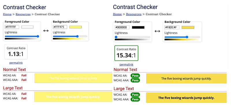
The WCAG 2.1 suggests a contrast ratio of at least 4.5:1 for normal text and 3:1 for large text.
Black text on a white background has a high colour contrast of 21:1, but using pure black (#000000) against pure white (#FFFFFF) isn’t recommended.
That’s because extreme contrast at a single pixel distance increases eye strain for users, especially those with light sensitivity and cognitive disabilities like dyslexia.
Use colour contrast testing tools like the WebAIM Contrast Checker or Stark plugin to test text colour and background colour combinations while taking text size into account.
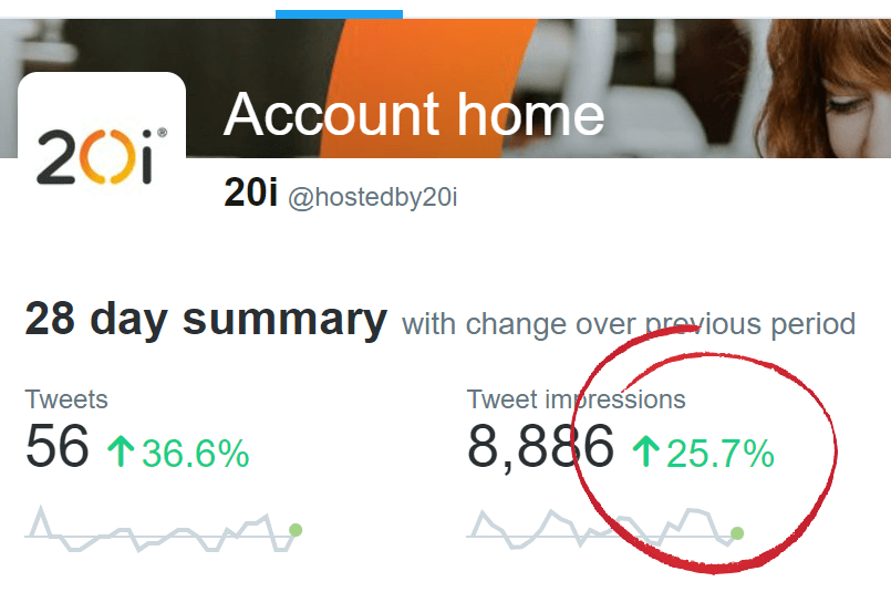
If you use Google Chrome, you can also use the Chrome DevTools accessibility checker to test contrast anywhere online.
To do so, open DevTools and use the ‘Select an Element’ tool to click on the element you’d like to check.
In the example below, we used the Twitter Analytics page, where positive results are shown in green on white.
Here we’ve highlighted the tool you need in the top left:
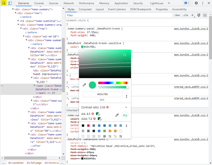
Then, go to Styles and click on the colour box. If there isn’t enough contrast, it will have a red notification next to it.
Clicking on this notification will show you a useful colour chart, which shows the good contrast (AA) and the best contrast (AAA), represented by two lines. You can see this above.
In the example, we could move the white circle down – making it darker – to get to the colour it needs to be for best contrast. You can then make changes in your code.
Avoid using red and green. CVD affects approximately 300 million people worldwide, and red-green colour blindness is the most common type.

Colour alone shouldn't be used to convey important information (e.g., ‘click the blue button’). Secondary indicators such as icons, underlined words, or contrast changes help differentiate elements.

Add texture or patterns when using graphs and charts to differentiate various data points.
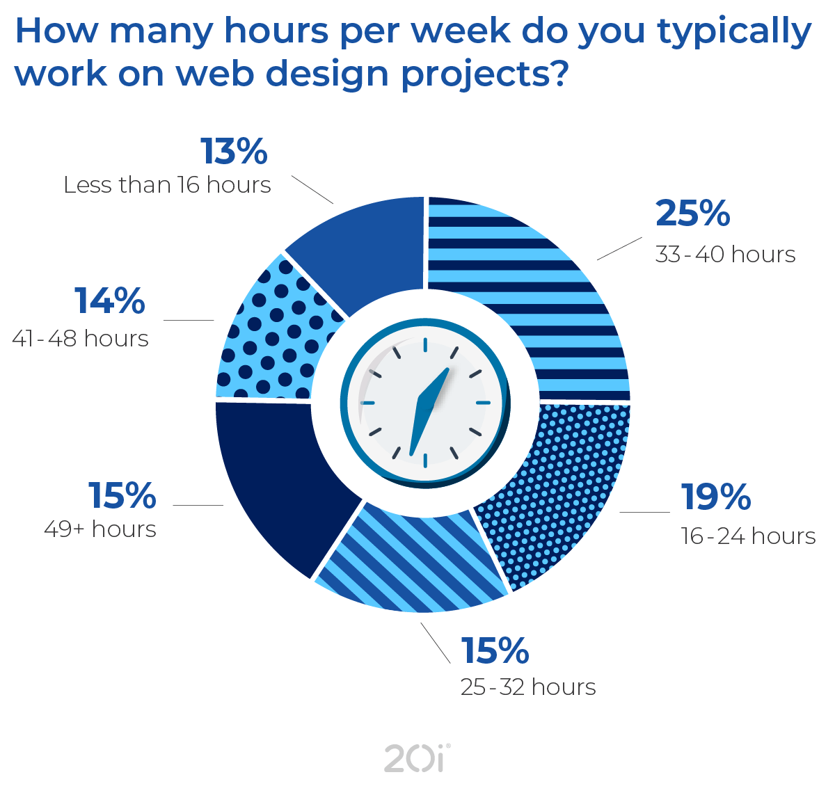
For example, use a line graph or pie chart that shows different patterns so users can distinguish between them easily, like we did for the Web Designer Survey results above.
2. Use larger text and simpler fonts
Addresses: Users with visual and cognitive disabilities.
Most online interactions are text-based, so website accessibility tip number two is to optimise text for different readers.
People with visual and cognitive disabilities might find it difficult to read small text and non-standard fonts, so make your website accessible by considering font size and style.
Use sans-serif fonts. These fonts are easy to read in both small and large font sizes. Examples include Tahoma, Calibri, Helvetica, Arial, and Verdana.

Keep default font sizes at least 9pt (or 12px). WCAG Guidelines say that users should be able to read the text even when zoomed to 200%

Enable users to manually select font sizes, like the Wall Street Journal below.

Make sure text is left-aligned and each line doesn’t exceed 70–80 characters.

Left-aligned text maintains consistent character and word spacing, unlike justified blocks of text, which people with cognitive disabilities can find hard to read.
3. Differentiate links and buttons explicitly
Addresses: users with visual disabilities.
Users have established expectations about digital elements, and links are one of the things that have worked the same way for years. For example, linked text is often underlined and a different colour from the rest of the body text.
Users with visual impairments often use assistive technology (AT) like screen readers, which provide a separate list of links to make page navigation more accessible. So using vague labels for anchor text like ‘click here’ doesn’t give users context.
Make links and buttons descriptive. Screen readers provide a separate list of links to make page navigation easier, so vague labels for anchor text like ‘click here’ don’t give users context. Descriptive links and buttons also have a SEO advantage.
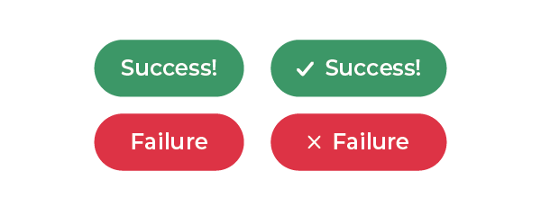
Incorporate other elements to convey gravity. For example, the caution (⚠️) icon indicates warning or danger, while a checkmark (✔️) icon means success, and a cross (❌) can indicate failure.
Button states
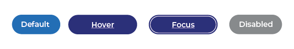
For buttons and links, ensure their appearances change for every action. Distinguish between hover, focus, and click for buttons.
4. Create keyboard-accessible navigation
Addresses: users with physical and visual disabilities.
Users with physical disabilities may need special equipment to access the internet, such as:
- Ergonomic keyboards or mice
- Pointers and other tools to aid with typing
- Hands-free tools such as foot- or shoulder-operated switches
They rely on keyboards primarily, using the Tab key to move forward and Shift+Tab to go back, for example.
Keyboard-accessible navigation helps users with motor skill disabilities. They can use screen readers to access links, menus, and buttons using keyboard shortcuts.
Avoid using elements that break keyboard navigation, like dropdown menus. On dropdown menus, the top menu items are accessible, but the submenu items often aren’t. Instead, assign shortcuts or access key capabilities. For example, pressing ‘1’ will take you to the homepage, ‘2’ to the About page, and so on.

Limit the number of links you include on a page. Links are a form of navigation. Users know they’ll need to go to another page when they see them, so having too many of them will make navigation more difficult.

Add a ‘Skip Navigation’ link. That’s an anchored link on the page that lets users jump down the page to a specified location when they click enter with a keyboard.
For example, pressing the tab key twice on the BBC website reveals a ‘Skip to content’ option so users can avoid navigation on the page header.

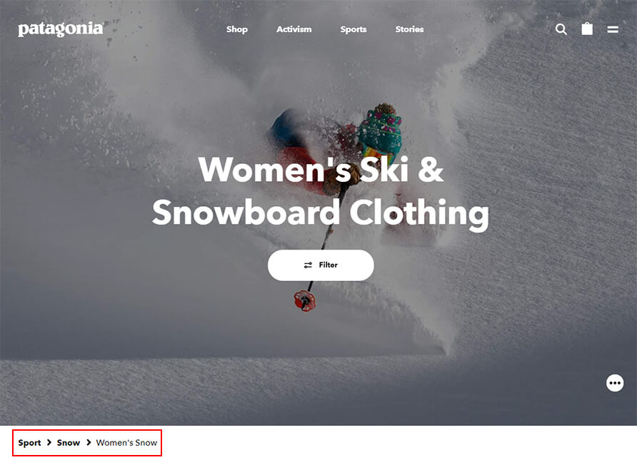
Use a breadcrumb trail. Those help users visualise site architecture. It helps them identify the page’s current location and navigate back to previous webpages.
Separate the items in the breadcrumb menu with a visible separator, like ‘>‘ or ‘/‘.
5. Adaptation and responsiveness
Related to navigation, you should always ensure that your website can be viewed on any device, by anyone.
The website should not require a particular orientation. You should be able to rotate the site to any orientation, and there shouldn’t be horizontal scrolling.

It should also be adaptable for most screen sizes and pixel densities.
6. Use image alt text
Addresses: users with visual disabilities.
Screen readers can’t process certain types of content, like images, tables, and graphics. Instead, they rely on alternative (or alt) text, which is a written description of an image’s appearance and function.
Screen readers will read the description aloud to the user. If the image doesn’t have alt text, the screen reader skips it entirely.
All relevant images are accompanied by alt text.
Alternative text is only helpful for relevant images on the page.
Decorative images or elements that don’t add value can have empty alt text.
That’s because screen readers read code and not just text, so some elements can be annoying for visually-impaired users trying to access the content.
Ensure that alt text is descriptive. If the image is a link, the alt text should explain what will happen if the user selects that image.
Screen readers will mention that it’s an image, so you don’t have to include ‘This is an image of…’ when writing your alt text.
You can insert target keywords in your alt text as part of your SEO strategy, but don’t overstuff them.
Keep it short and relevant. In general, no alt text is better than irrelevant alt text.
7. Organise content structure with headings
Addresses: users with cognitive and visual disabilities.
Organising your content structure actually improves readability for all users.
Most people these days skim content instead of reading it word for word. That’s why you should use headings (such as <h1> and <h2>) when structuring content to help readers skip directly to the parts they want to read.
Users with cognitive disabilities may have difficulty understanding complex sentences and long passages of text. That’s why you should also break large chunks of text into more readable parts.
Organising content also helps screen reader users with visual disabilities to navigate pages. When users land on a page, screen readers read the title first and ask if they want to skip to the different headings. Headers help screen readers determine each section’s context.
If those aren’t reasons enough, organising your content with headers can also help search engines decide what’s important, leading to better search engine performance.
Establish text hierarchy through headings that describe the section's content.

Like with headings, use descriptive titles that state a page’s topic or purpose.
8. Make dynamic content accessible
Addresses: users with cognitive, auditory, visual, and physical disabilities.
An accessibility best practice when you have multimedia content on your website is to include text options like captions and transcripts. They’re critical for people who are deaf or mute, and those who can’t play media in public places.
They also aid users with cognitive disabilities who can’t keep up with audio or video content.
Include a transcript for audio content. W3C gives plenty of suggestions to make audio and video more accessible.

Embed closed captions into your videos so users can read them no matter what platform they’re using.

Multimedia content shouldn’t start automatically when the webpage opens. If it must, there should be controls to pause, stop, or turn down the volume.

Use subtle animations. Make sure they don't flash too much, as those could trigger people with epilepsy.

Ensure that there is sufficient time before content times out. Give users ample time on web apps before timeouts, and inform them of potential data loss should they need to reauthenticate it. Configure the program to allow data recovery in case of a timeout.
9. Using ARIA Attributes to Enhance Accessibility
While semantic HTML provides a strong foundation for web accessibility, complex web applications often require additional information to be compatible with assistive technologies.
Accessible Rich Internet Applications (ARIA) are categorised as such through the inclusion of attributes added to HTML elements that define their role, state and properties.
By using ARIA attributes effectively, you ensure that users with screen readers and other assistive technologies can understand the purpose and functionality of interactive elements on your website. You can use ARIA attributes to:
Identify interactive elements
Not all interactive elements on a website are inherently keyboard accessible. ARIA attributes like role="button" or role="menuitem" can clarify the interactive nature of elements like custom buttons, dropdown menus or accordions.
Convey Live Updates
ARIA attributes like aria-live can be used to inform screen readers about dynamic content updates on a webpage. This allows users to stay informed about changes without needing to refresh the entire page.
Relationship descriptors
Certain interactive elements have relationships with other parts of a webpage. ARIA attributes like aria-labelledby or aria-describedby can be used to establish these relationships, allowing screen readers to announce them in a clear and contextual manner.
Taking the time to implement ARIA attributes correctly can significantly improve the user experience and ensure your website is truly inclusive.
Identify all interactive elements on your webpage (buttons, menus, accordions, etc.)

Assign appropriate ARIA roles for non-standard interactive elements (e.g. role="button" for custom buttons)

Use aria-live for dynamic content sections that update frequently

Utilise aria-labelledby or aria-describedby to connect interactive elements to relevant labels or descriptions

Test your website with assistive technologies to ensure ARIA attributes are interpreted correctly
10. reCAPTCHA and Accessibility
reCAPTCHA is a powerful tool for combating spam and bots, but it can also prevent people from accessing your website. Users of assistive technologies are foremost among those for whom the protocol presents a significant obstacle.
Ensure that reCAPTCHA does not keep legitimate users and customers out:
Alternatives
Consider offering alternative CAPTCHA solutions for users who may struggle with traditional visual or audio challenges. This could include text-based CAPTCHAs or challenges that rely on logic or simple maths problems.
Clear instructions
Provide clear and concise instructions for completing the reCAPTCHA challenge. This will help users understand what is expected of them, regardless of their ability level.
Error Handling with Accessibility
Ensure error messages associated with failed reCAPTCHA attempts are informative and accessible. Use screen reader-friendly text and avoid overly technical language.
Focus Management
When a reCAPTCHA challenge is presented, ensure focus is set appropriately on the challenge itself. This will make it clear to users with screen readers where they need to interact.
Keyboard accessibility
If reCAPTCHA challenges involve interactive elements; ensure they are fully keyboard accessible. Users should be able to complete the challenge solely with a keyboard.
These guidelines will enable you to integrate reCAPTCHA into your website without compromising accessibility for users with disabilities. For more information about reCAPTCHA visit: https://developers.google.com/recaptcha
11. Animations and Accessibility
Animations can add interest, interactivity and flair to your website. Striking the right balance is important as you design your website with consideration given to how animations might impact users with accessibility issues. Here is how to ensure the animations on your website remain accessible:
Provide control over movement
Users with motion sensitivities or cognitive disabilities may find constant animations distracting or disorienting. Offer a mechanism for users to pause, stop or hide animations altogether. A simple toggle button or link can accomplish this function while not detracting from your design and intent.
Prioritise content over movement
Do not rely solely on animations to convey important information. Ensure your content is clear and understandable wile static. This principle is especially important for users who choose to disable animations.
Flashing content
Avoid using rapidly flashing content, especially at high contrast levels. Flashing lights can trigger seizures in users with photosensitivity. If animations do include flashes, keep them brief and below the WCAG recommendation of 3 or less flashes per second – and avoid using red hues.
Alternatives for complex animations
For intricate animations that convey information; provide alternative ways for users to access that same information. This might include static visuals, text descriptions or audio explanations.
By following these principles, you can create engaging animations that do not compromise accessibility for your users.
Identify all animated elements on your webpage.

Consider offering a user-controllable option (pause, stop, hide) for animations.

Ensure animations do not rely solely on movement to convey information.

Avoid using rapidly flashing content, especially at high contrasts.

For complex animations, provide alternative ways to access the information they convey (text, audio, static visuals).

Test your website with assistive technologies to ensure animations don't interfere with screen reader functionality.
12. Accessibility through clarity
Clear and concise language isn’t just good practice: it is necessary for accessibility. When website copy is written in a straightforward manner, it benefits everyone – most especially users with disabilities who rely on assistive technologies or may have cognitive limitations.
Why clarity matters
Screen reader compatibility
Screen readers interpret and vocalise website content. Complex sentence structure, jargon and overly technical language can be difficult for screen readers to process and convey coherently. Clear and concise writing ensures a smooth and understandable experience for users relying on this assistive technology.
Cognitive Processing
Users with cognitive impairments may struggle with complex sentence structures or overly technical language. Plain language reduces cognitive load, making it easier for users to understand the information presented on the page.
Writing for Accessibility
Keep it Short and Simple
Opt for shorter sentences and avoid overly complex vocabulary. Aim for a writing style that is easy to understand at a glance.
Active voice
Active voice sentences are generally clearer and more concise than passive voice. For example, “The user clicks the button” is more direct than “The button is clicked by the user.”
Explain Acronyms
If you must use acronyms; define them the first time they appear. Make sure to do this for each page so that users who access directly, through search engines, adverts or links enjoy the benefits of having terms used throughout the page defined upon entry.
Use Headings and bullet points
Break up large blocks of text with clear headings and bullet points. This improves readability and makes it easier for users to scan the content and find the information they need.
Focus on the user
Write in a way that directly addresses your audience. Use “you” statements and avoid overly technical jargon.
Consider readability score
There are online tools that calculate the readability score of your text. Aim for a score that reflects your content being easily understandable by a broad audience.
By following these guidelines, you can create website copy that is accessible and user-friendly for everyone.
Review your text for sentence length and complexity. Aim for shorter sentences with clear subject-verb relationships.

Identify and replace jargon and overly technical language with simpler alternatives.

Define acronyms and technical terms the first time they are used per page.

Break up large blocks of text with clear headings and bullet points.

Use online readability scoring tools to ensure your content is easily understandable.
Final thoughts: web accessibility best practices
Web design that doesn’t consider the needs of users with disabilities is a form of exclusion.
It’s a lose-lose situation for both visitors and your business. Users will avoid your website when they can’t get the information they need from it. In turn, you lose a potential client or customer.
If you’re new to accessibility, follow these eight tips to design an accessible website, and use our web accessibility checklist to keep track of your work. Eventually, these best practices will become second nature, and both your users and the websites you create will benefit from them.